 Personally, I love WordPress[1] and thus I’m always on the lookout for the best plugins and themes out there. Once in a while, something comes along that makes me go, “Wow.” — a plugin or a theme that stretches WordPress’ flexibility and user-friendliness to new levels of awesome. Thrive Content Builder is one of those things.
What is the Thrive Content Builder?
In a nutshell, it’s a plugin designed to make creating kickass pages look easy. It’s from Shane Melaugh’s Thrive Themes and it addresses a simple problem most of us have had with WordPress — the editor itself.
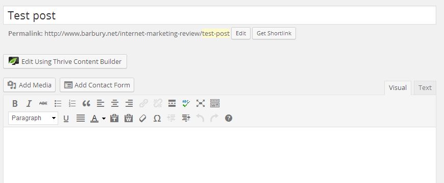
Well, let me explain. The editor is fine if you’re just making, say a blog post. The WYSIWYG (What You See Is What You Get) editor provides all the things you need for a simple article. If you need more than just the usual bold, italics, and justify buttons, then you’d want to expand the Kitchen Sink to get more functions like font color and paste from Word. If you wanted more formatting in your posts, like insert a box or a button, or divide a text into columns, then you will have to resort to using plugins or themes with shortcodes[2].
Thrive Content Builder aims to be an honest-to-goodness WYSIWYG editor and from what I’ve seen of it, it does exactly what it says in the box.
What do you get from the plugin?
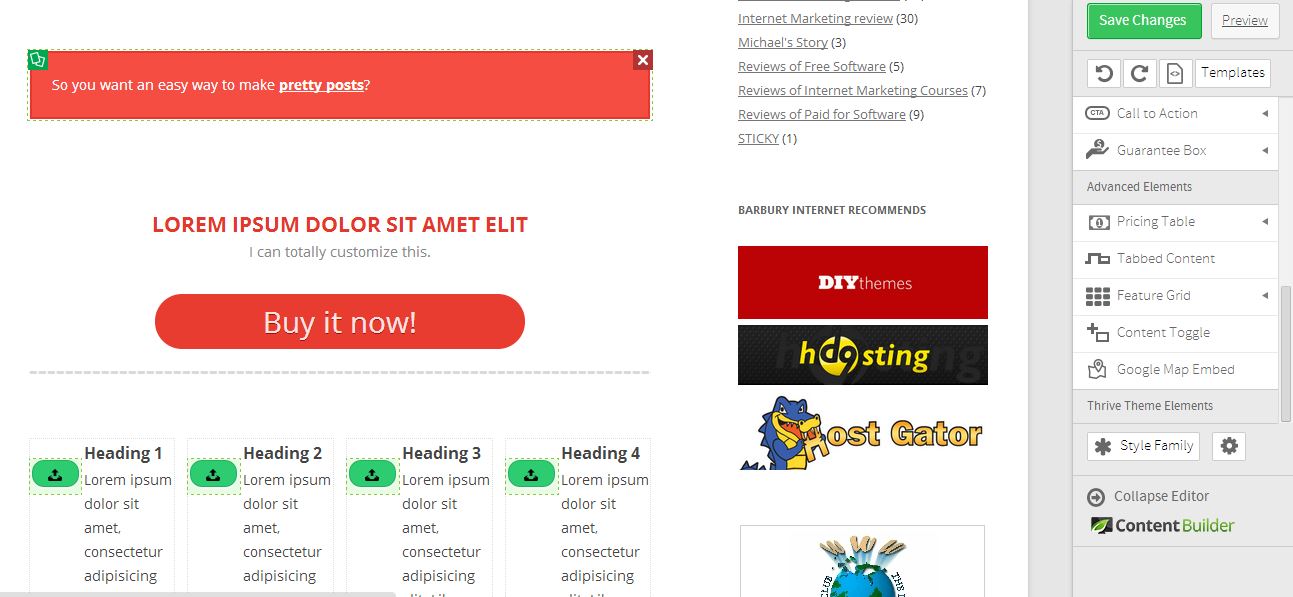
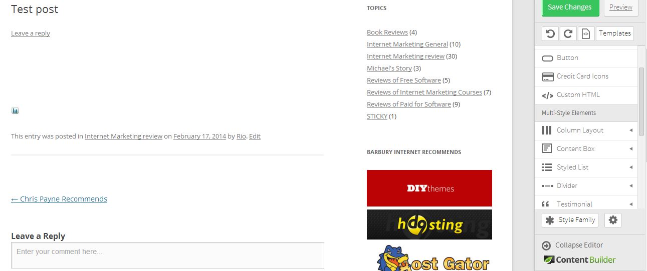
For one thing, you get a real time editor together with a few box/column/line styles. You can customize nearly every bit of your page or post down to the last call to action box. It makes adding buttons, columns, and testimonial forms easy. Everything is drag and drop. Or you can click on an element you’d like to add and drag it to the spot where you want it.
You can even make little edits directly on the code itself via the HTML button.
Should you get it?
Well, the short answer to this question is yes, you should. But before I expound on that, here are a few pros and cons to the Thrive Content Builder:
Pros:
1. It’s designed to make your life easier, especially if you care very little about code. It does the heavy lifting, so to speak.
2. It’s drag and drop – again, designed to make building pages so much easier.
3. You see exactly what you’re doing from the get-go, so no more ferrying from the editor to a preview to see the stuff you’ve already done and back again to make more changes.
4. Did I mention it makes creating pages and posts easier?

Cons:
1. While using it, there was a noticeable amount of lag. This can probably be explained by my heavy Chrome usage – I do have a lot of tabs open all at once – so I can’t blame it all on the plugin itself.
2. Because there was a certain amount of lag, some formatting reverted back to their unformatted selves. I was several boxes down when I noticed what had happened, so I had to go back up to see to those sections again. It was quite frustrating, but again I can’t blame it all on the plugin (see number 1).
3. The rest of my complaints would be nitpicky at best: the bullets not spacing themselves properly, the UNDO button undoing an entire section and not just a mistyped word (I instinctively press Ctrl+Z when making mistakes, and this sent entire swathes of formatting and content boxes into the void.), and other stuff like that.
Despite the downsides, the Thrive Content Builder is an awesome plugin to have. It does take a while to get used to its newfangled functions, but once you do get the hang of it, you’ll probably wonder how you managed before it.


